Debbie wanted a website that boldly asserts her queer identity while ensuring clarity and attracting the right clientele.
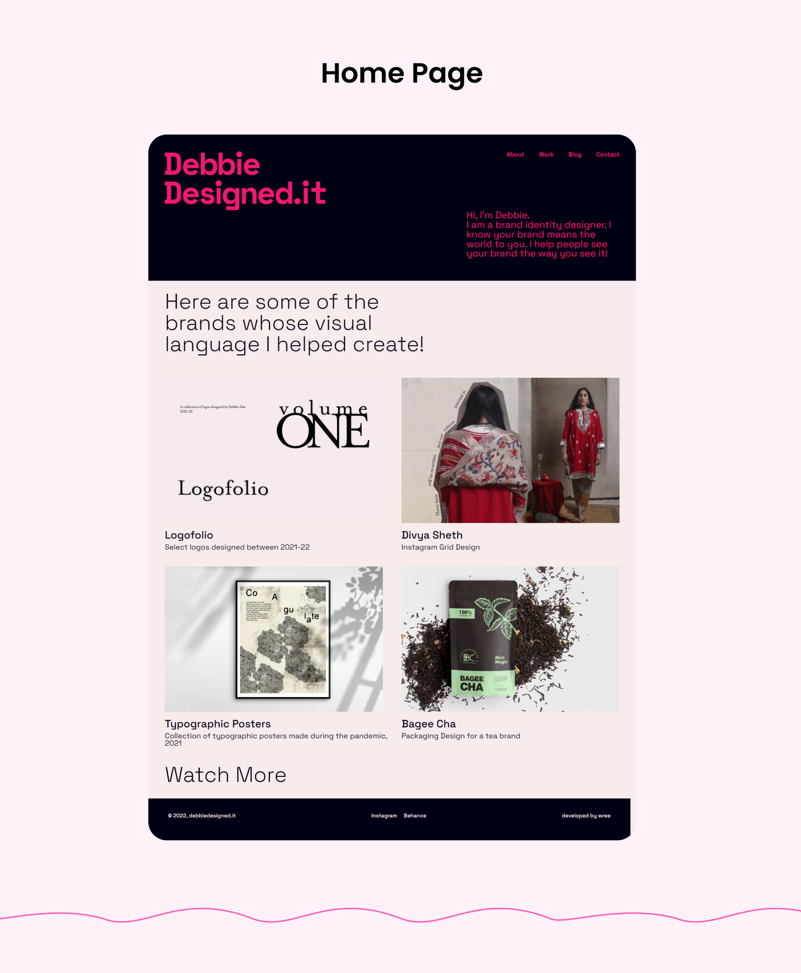
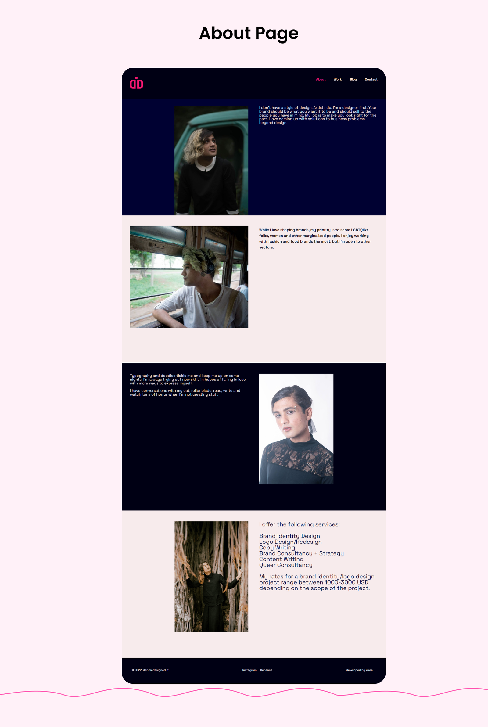
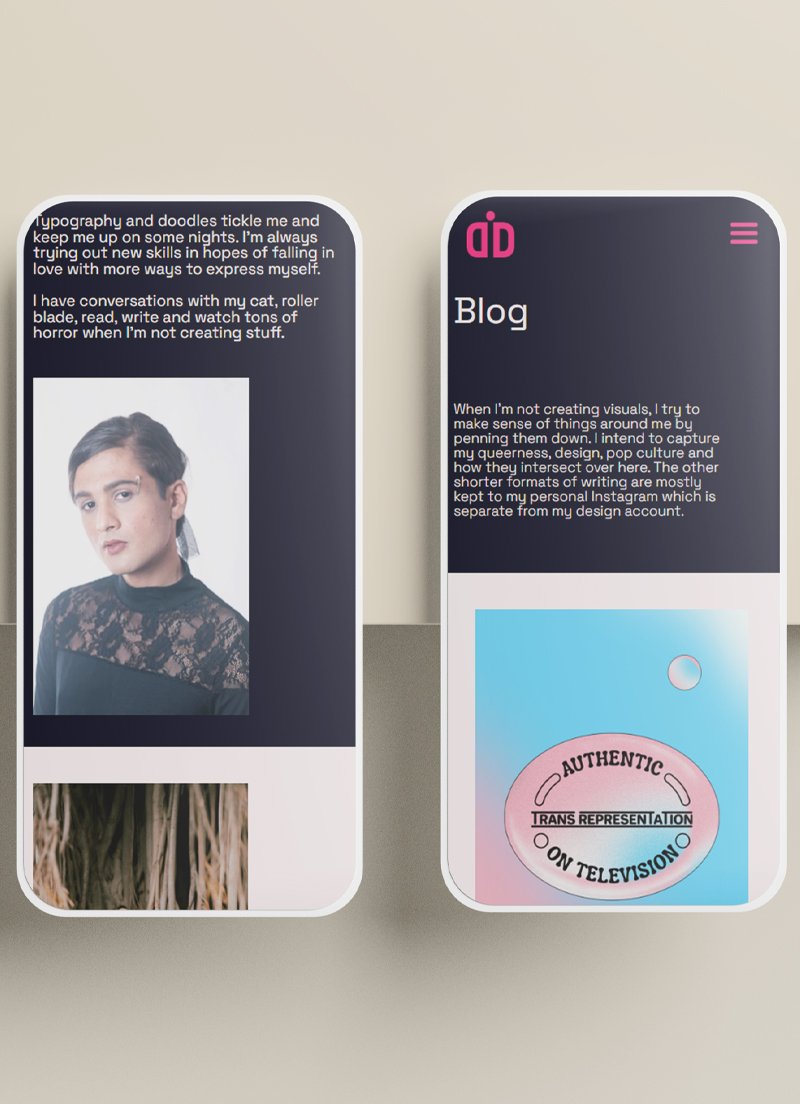
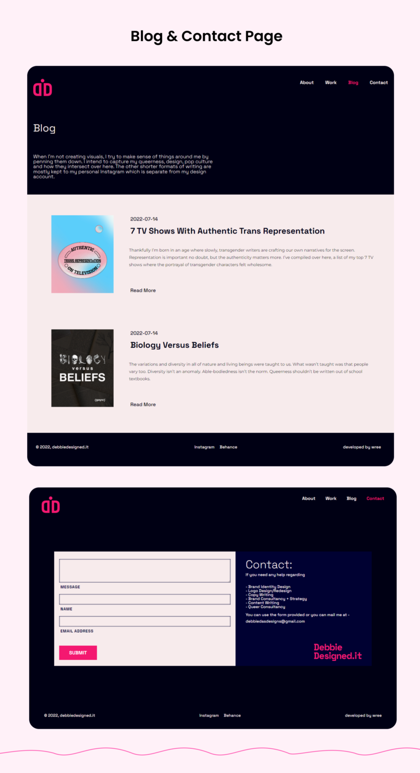
Creating an online headquarters for Debbie was centered around a key challenge: blending functionality with a vibrant and unapologetic aesthetic that resonates with her specific audience. Debbie’s commitment to serving LGBTQIA+ folks, women, and other marginalized groups meant the website needed not just to stand out visually but also to be welcoming and clear. The primary hurdle was the use of bold, expressive colors—pink and purple—while ensuring that the content remained legible and the site attracted the right clients, particularly from the fashion and food sectors.
Goal
We conducted thorough market research, honed Debbie's brand message, and developed a vibrant new design to authentically showcase her identity.
Distinctive Brand Identity: Reflecting Debbie’s unique approach to brand identity, logo design, and consultancy through a website that itself serves as a showcase of her creative capabilities.
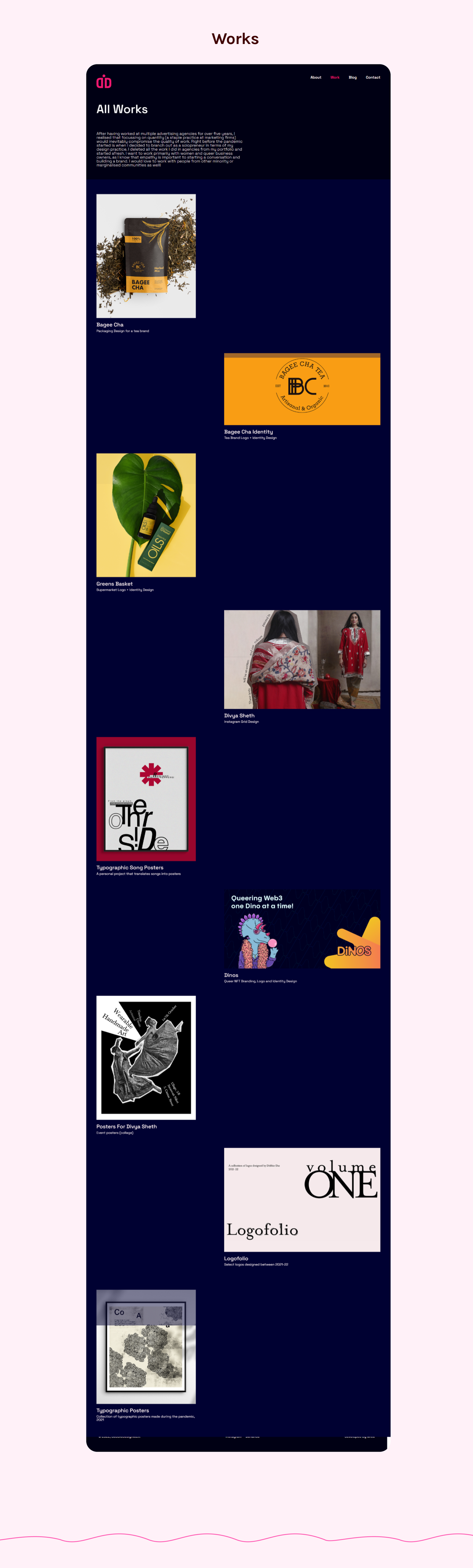
User-Friendly Portfolio Layout: Developing an innovative portfolio arrangement that allows visitors to easily navigate and explore Debbie’s diverse services and past projects.
Inclusive Design: Ensuring the website is accessible and inviting to all, especially the LGBTQIA+ community and other marginalized groups, through thoughtful design choices and inclusive language.
Effective Client Attraction: Utilizing strategic SEO and content placement to attract Debbie’s ideal clients—those in the fashion and food industries who value creativity and inclusivity.
Result
The brand new website led to heightened customer engagement, increased inquiries, a surge in new clients, and a more prominent brand presence in the industry.
The completed website is a vibrant and dynamic online hub that perfectly encapsulates Debbie’s brand and ethos. The use of pink and purple not only highlights her queer identity but also sets a warm, inviting tone across the site. The portfolio is uniquely arranged, offering an intuitive user experience that showcases Debbie’s breadth of services—from Brand Identity Design to Queer Consultancy. Each section of the site is designed with legibility in mind, ensuring that the bold colour scheme enhances rather than overwhelms the content.
The website also featured custom CSS that significantly enhanced the visual layout of Debbie’s portfolio by uniquely targeting odd and even grid items separately. This subtle yet powerful adjustment allowed for a dynamic, engaging arrangement, making each piece of the portfolio stand out.
Thanks to meticulous design and strategic SEO, the website successfully attracts the kind of progressive, creative clients Debbie loves to work with. Feedback has been overwhelmingly positive, with clients praising both the site’s visual appeal and its ease of use—proving that style and substance can coexist beautifully.
We excel in crafting distinctive websites that set themselves apart from the competition.
We excel in crafting distinctive websites that set themselves apart from the competition.